DevCard Customization
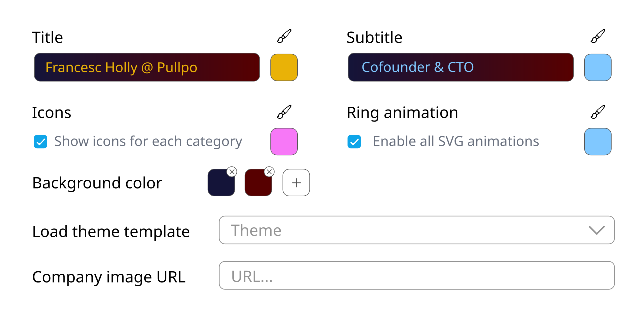
On the right hand of the DevCard section of your profile, you'll find the following user interface:

Components
Through this interface you can choose what the title and subtitle of your DevCard will be as well as their respective colors. By default, the title will be <Your handle> @ <Your company> while the subtitle will be the role you have set in your profile ("Developer" if none).
You can also enable or disable both the icons and the animation, and you can customize their colors too.
Background
Initially, the background color is set to a single solid color. You can create background gradients oriented from left to right by adding new colors to the background color array (clicking the "+" button). Symmetrically, you can remove colors by clicking on their "x" button. If you remove all colors, the background color of your DevCard will be transparent.
Even though the preview of the DevCard on the left side of the screen updates automatically after a couple seconds of no changes, you can easily see how the colors you choose combine looking at the title and subtitle text boxes, since we paint their backgound and text color accordingly.
Theme templates
We have some initial theme templates set up for you to get you up and running. Loading a theme template will override any color selection and apply the theme's one. In the dropdown menu you can see the colors of each theme represented by four dots. They are, in order:
- Title color
- Subtitle, text and ring color
- Icons color
- Background color (white and transparent look alike)
Company image
You can add any valid image URL. By default, Pullpo will load the profile image of your GitHub organization, but if it's poor quality or the background is not transparent, you can change the URL to load a better one.
If you don't find your company's logo online, you can also upload it yourself and copy its URL here. Since in the next step you will need to create a GitHub repository with the same name as your username (spoiler alert), you can upload your picture there.
Some design tips ;)
If you're not finding a nice combination of colors for your DevCard, try loading your company's logo first and build your color palette around it. Your company has likely already researched and defined its brand with a good color combination. Take inspiration from it, maybe use the color-picker tool to extract some colors from the logo itself, or from your company's landing page!